
When homeowners begin planning a remodel, conversations often start with layouts, cabinetry, fixtures, or finishes. But one of the most powerful design decisions is often overlooked: color. Color does far more than make a room look beautiful. It influences mood, perception, energy levels, and even the way we experience space. Our designers use color psychology to influence how a space feels. The right palette can make a large room feel more intimate, a busy kitchen feel calmer, or a bedroom become a true retreat. Understanding color psychology can help homeowners make thoughtful decisions that not only reflect their personal style but also support how they want to feel in their home every day.
Why Color Psychology Matters
Color psychology affects us on both a conscious and subconscious level. While personal preferences and cultural influences play a role, many colors tend to evoke similar emotional responses. That doesn’t mean every blue room feels identical or every green space creates the same reaction. The intensity, undertones, natural light, and surrounding materials all influence the overall effect. Still, understanding the general emotional qualities associated with different colors provides a valuable foundation for design decisions. The goal isn’t to follow strict rules. It’s to create spaces that support the way you live.
Blue: Calm, Focus, and Sophistication
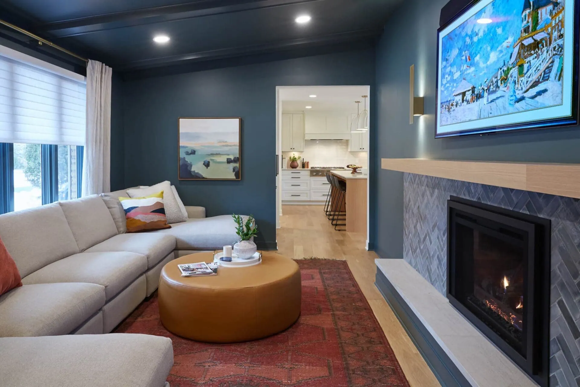
Blue is often associated with tranquility, stability, and trust. It has a naturally calming quality that makes it a popular choice for bedrooms, bathrooms, and home offices. Soft blue-gray tones can create a spa-like atmosphere, while deeper navy shades bring richness and sophistication. In a primary suite, blue can foster a sense of rest and relaxation. In an office, it may encourage focus and productivity. For homeowners seeking timeless appeal, blue remains one of the most versatile and enduring color families.
Green: Balance and Connection to Nature
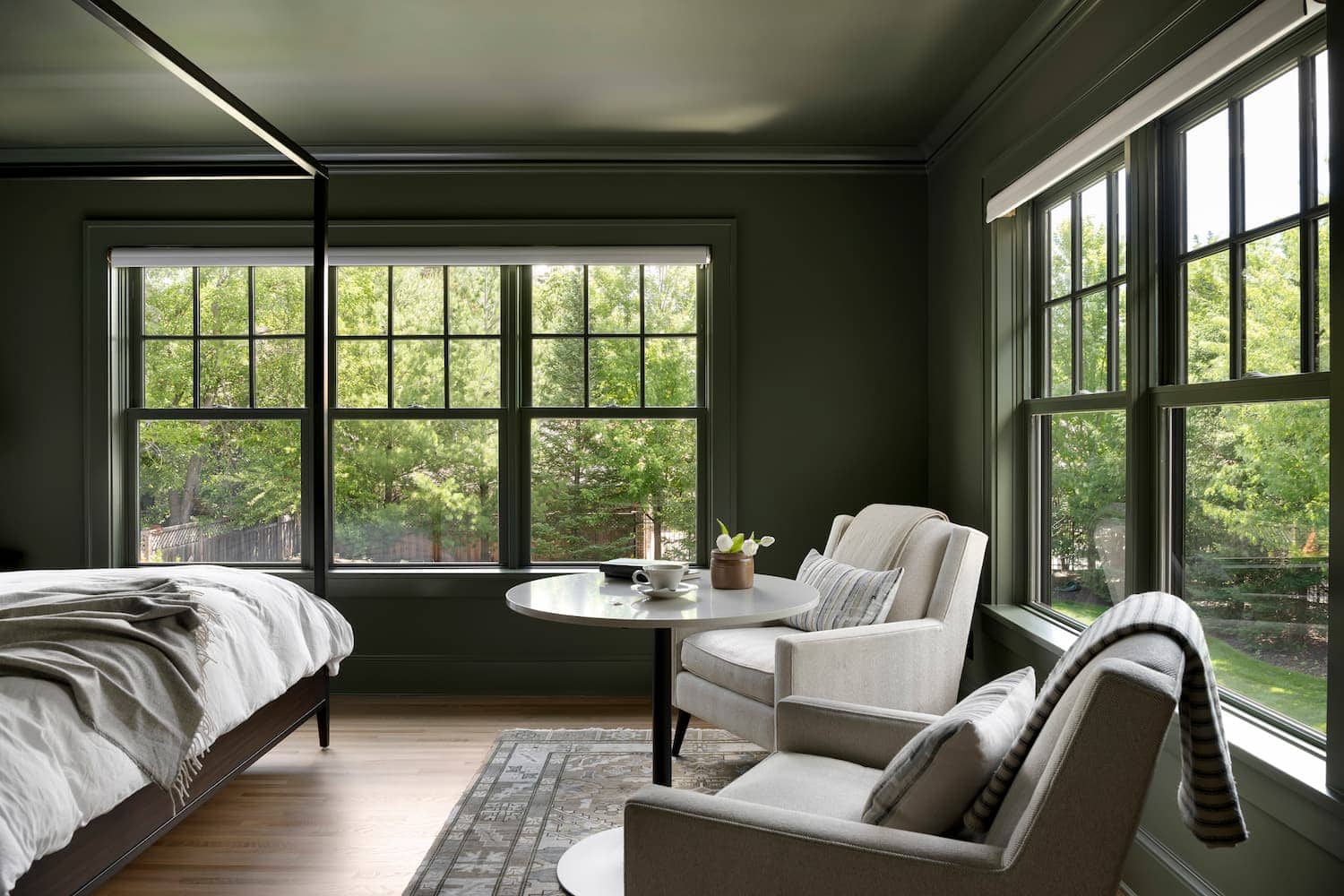
Green is often considered one of the most restorative colors because of its strong connection to the natural world. Sage, olive, and muted botanical greens have become increasingly popular in modern interiors, not simply because they’re trendy, but because they help create a sense of balance and wellness. Green works beautifully in kitchens, living spaces, mudrooms, and primary bathrooms. When paired with natural wood, stone, or organic textures, green helps blur the line between indoors and outdoors, creating spaces that feel grounded and inviting.
Yellow: Energy and Optimism
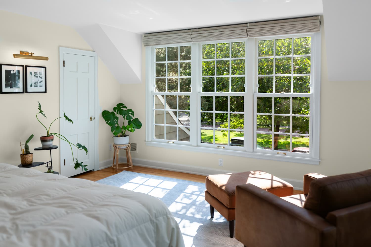
Yellow is often linked to happiness, optimism, and energy. When used thoughtfully, it can bring warmth and light into a space, especially in areas that receive limited natural sunlight. Rather than bright, saturated yellows, many homeowners today favor softer buttery tones, warm golds, or muted ochres. These shades add character without feeling overwhelming. Yellow often shines as an accent color, whether through cabinetry, furnishings, artwork, or decorative details that create moments of joy throughout the home.
Red: Passion, Energy, and Confidence
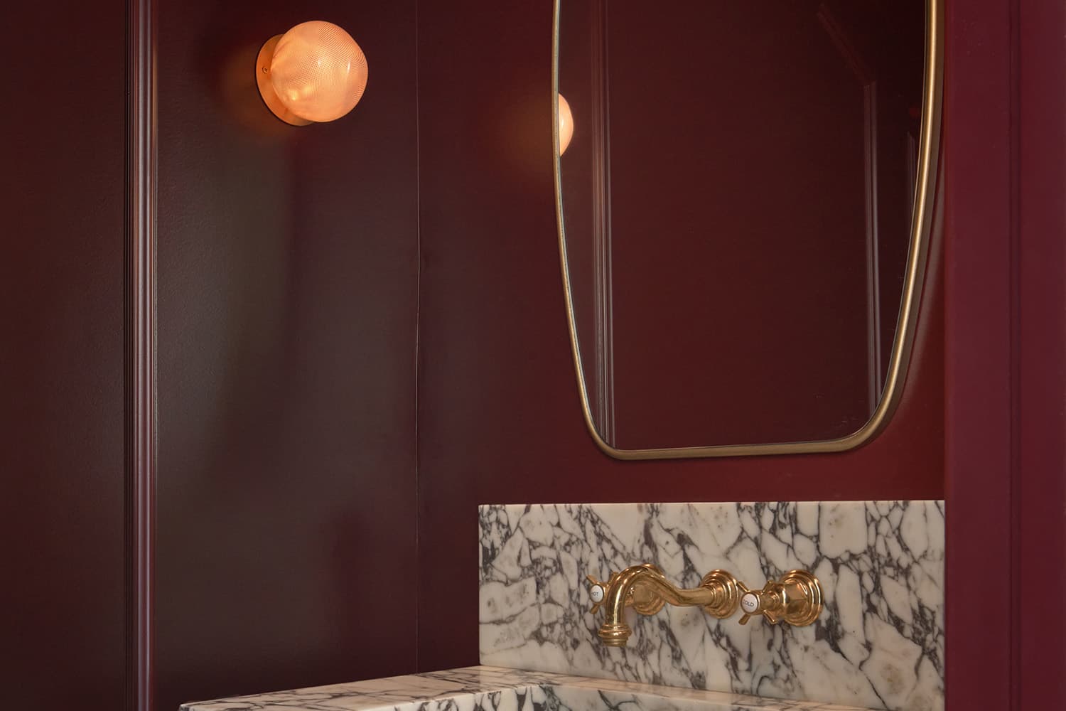
Red is one of the most emotionally intense colors in the design spectrum. It naturally draws attention and creates a sense of excitement, energy, and warmth. In residential interiors, red is often most successful when used intentionally rather than overwhelmingly. Rich burgundies, brick reds, and wine-inspired hues can add sophistication and warmth without feeling aggressive. These deeper interpretations create cozy, intimate spaces that encourage conversation and connection. Red works particularly well in dining rooms, entertaining spaces, libraries, and accent elements where homeowners want to create a sense of richness and character.
Pink: Comfort, Warmth, and Unexpected Sophistication
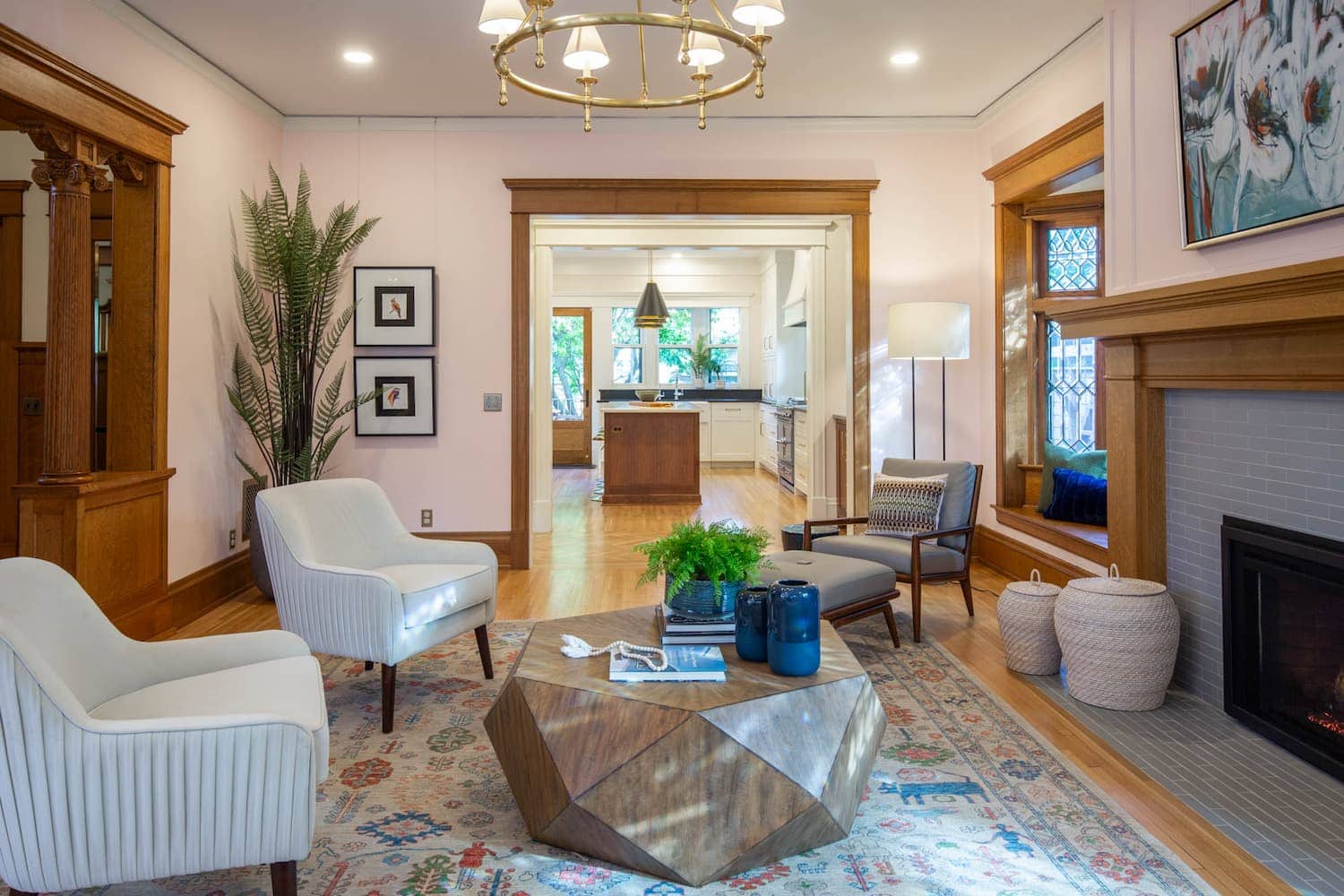
Pink has evolved far beyond traditional stereotypes. Today’s most popular pinks are subtle, sophisticated, and remarkably versatile. Soft blush, dusty rose, mauve, and muted clay-pink tones create spaces that feel warm, welcoming, and emotionally comforting. These colors often act almost like neutrals, adding warmth without overwhelming a space. In bedrooms, bathrooms, dressing areas, and even kitchens, pink can create a sense of softness and refinement. When paired with natural woods, dark metals, or stone surfaces, it feels timeless rather than trendy. Many designers appreciate pink because it tends to cast a flattering glow throughout a room, making spaces feel more inviting and comfortable.
Neutrals: Stability, Simplicity, and Balance
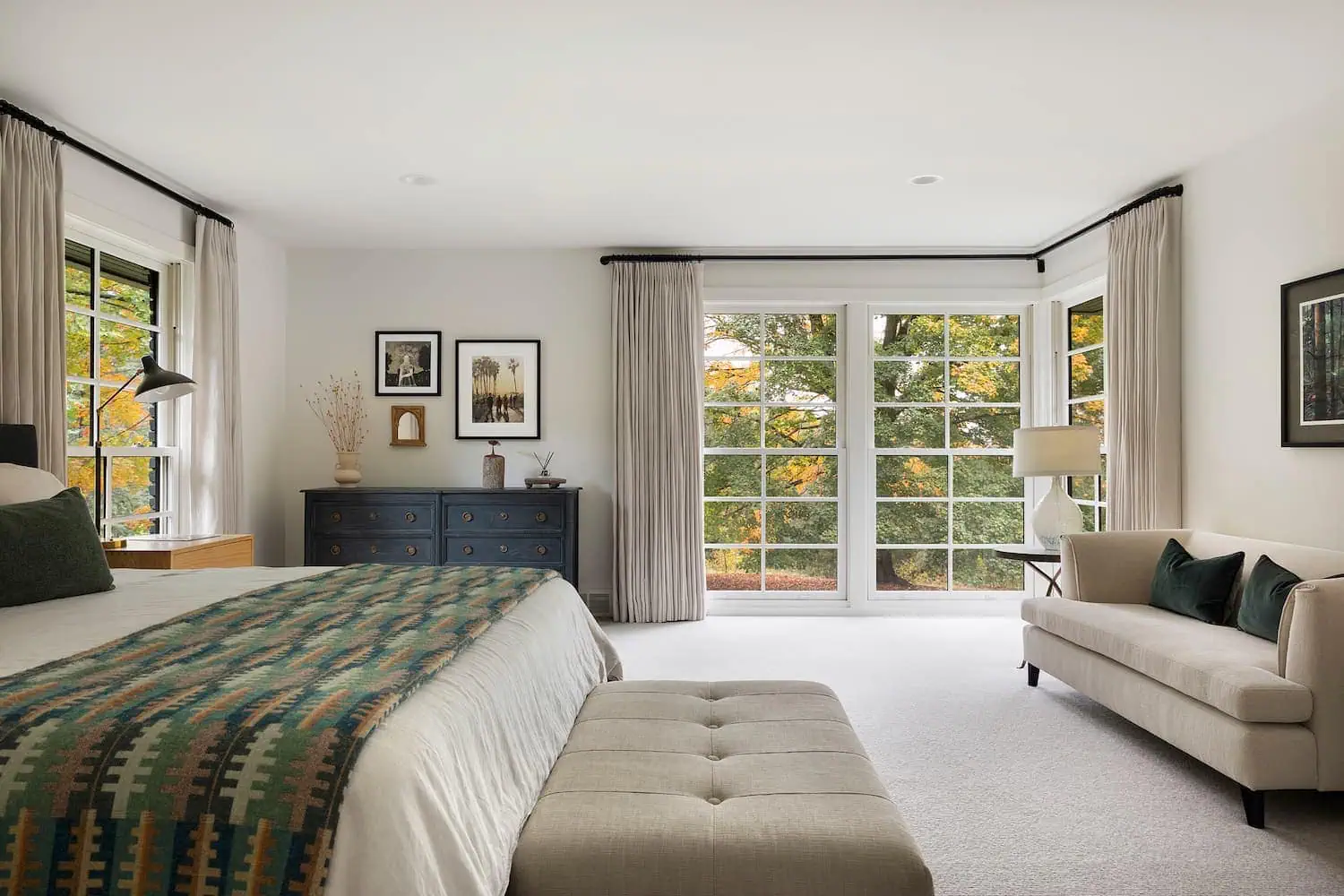
Neutrals are often viewed as the absence of color, but psychologically, they are powerful in their own right. Whites, creams, taupes, greiges, beiges, warm grays, and soft browns create feelings of stability, comfort, and balance. They allow homeowners to relax because the spaces feel visually calm and uncluttered. The key is understanding that not all neutrals create the same mood.
- Crisp whites feel clean and fresh.
- Creams feel warm and welcoming.
- Taupes create softness and sophistication.
- Greiges offer balance and versatility.
- Charcoal tones add depth and elegance.
For homeowners planning a long-term remodel, thoughtfully selected neutrals often provide the greatest flexibility while supporting a timeless aesthetic that won’t feel dated in a few years.
Black and Grey: Drama and Elegance
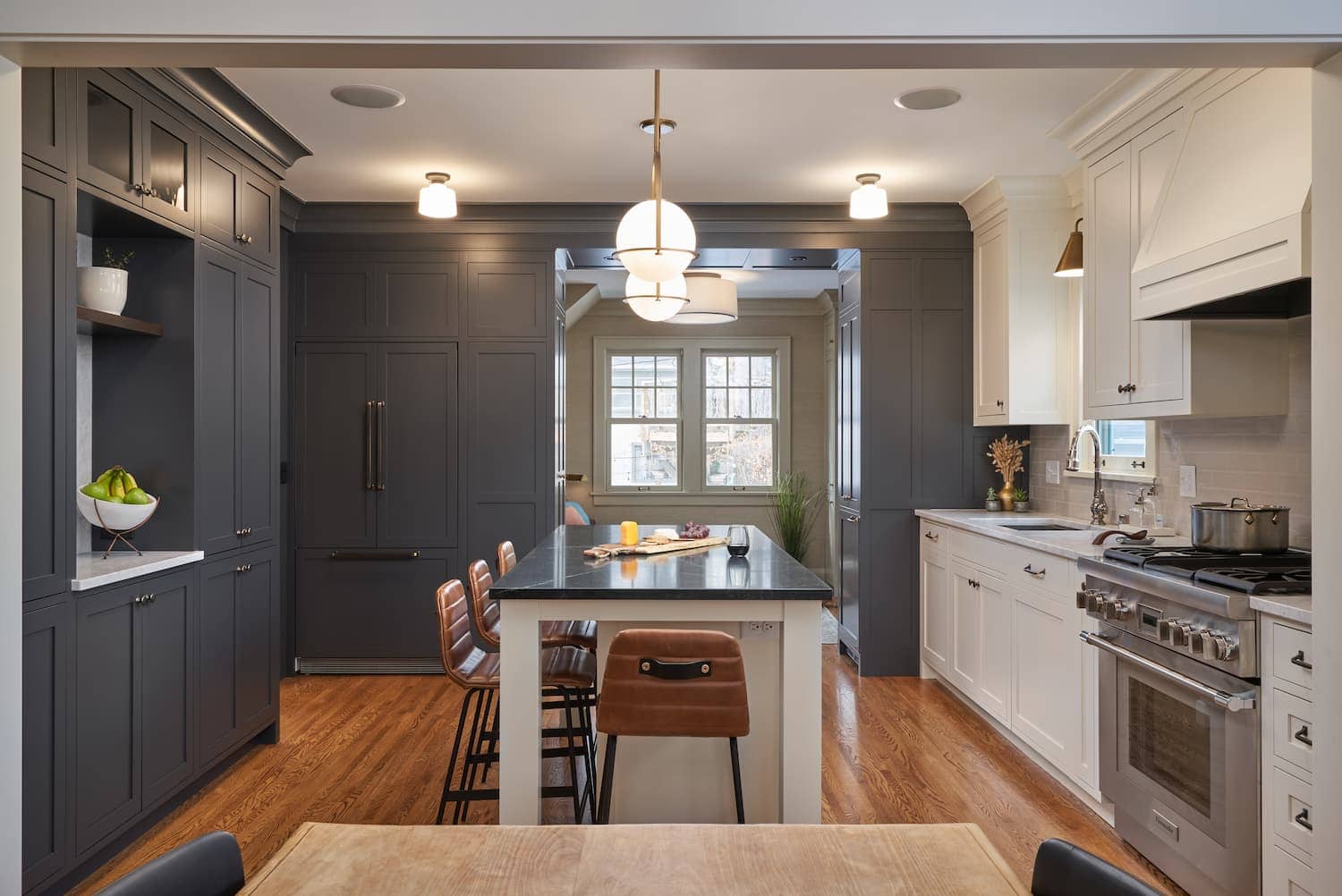
Dark colors add depth, contrast, and architectural interest when used thoughtfully. A charcoal-painted library, a black kitchen island, or dark built-ins can create striking focal points while enhancing the surrounding materials and finishes. Contrary to popular belief, dark colors don’t always make a room feel smaller. In some cases, they can create a sense of depth that actually expands the visual perception of a space. The key is balancing darker hues with adequate lighting and complementary materials.
Why Color Schemes Matter
Individual colors influence how we feel, but the real magic happens when colors work together. A successful interior rarely relies on a single color. Instead, designers use carefully considered color schemes to create balance, contrast, and visual harmony throughout a home.
Monochromatic Schemes
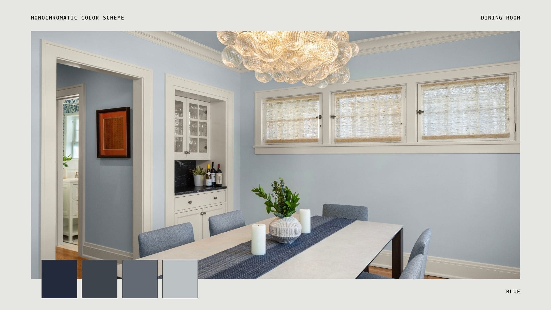
A monochromatic palette uses different shades, tones, and textures of a single color. Think of a room layered with soft sage walls, deeper green cabinetry, and lighter green textiles. These schemes tend to feel: calm, sophisticated, cohesive, and restful. Monochromatic designs are especially effective in bedrooms, primary suites, and wellness-oriented spaces.
Analogous Schemes
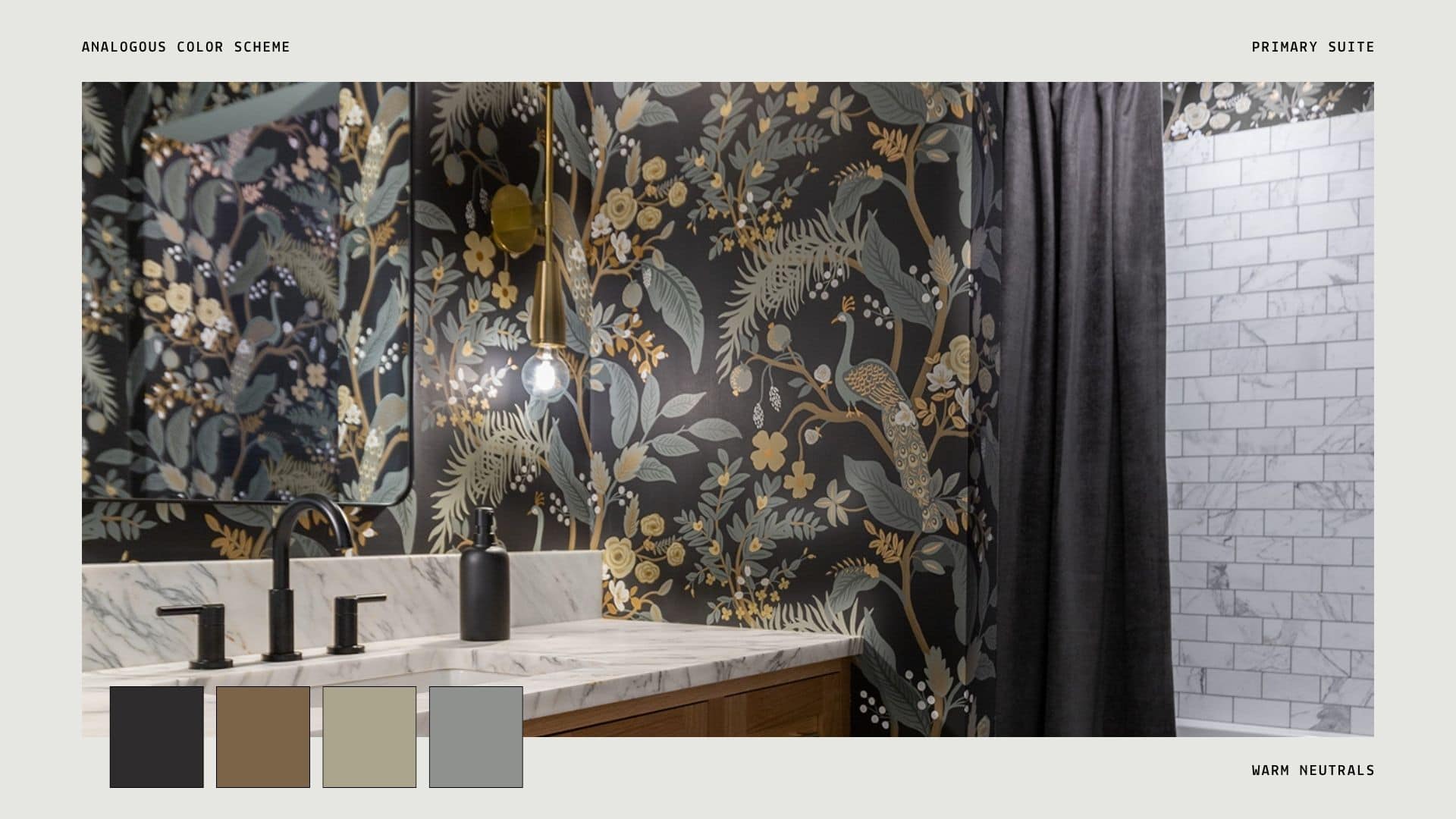
Analogous color schemes use colors that sit next to one another on the color wheel, such as blue, blue-green, and green. Because these colors naturally relate to one another, they create a comfortable and harmonious aesthetic. These schemes often feel: organic, relaxing, connected, and natural. Many of today’s most timeless interiors utilize analogous palettes because they create visual interest without appearing busy.
Complementary Schemes
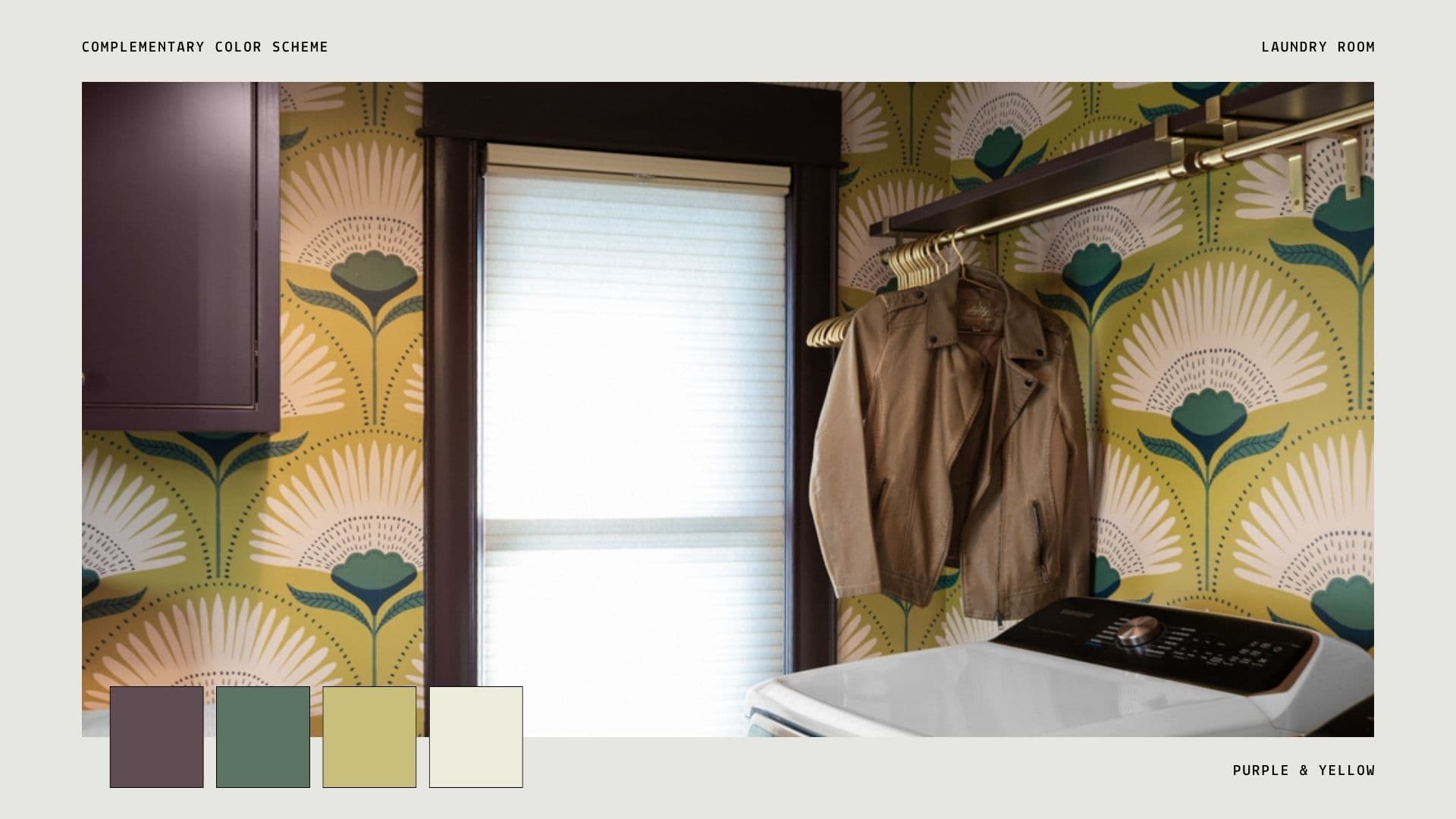
Complementary colors sit opposite each other on the color wheel. Examples include: blue and orange, green and red, or purple and yellow. Used thoughtfully, complementary palettes create energy and contrast while maintaining balance. Rather than using highly saturated versions of both colors, designers often incorporate one dominant color and use the complementary color as an accent.
Color Looks Different in Every Home
One of the most common mistakes homeowners make is choosing colors based solely on a photograph, social media post, or paint swatch. Natural light, room orientation, ceiling height, flooring, cabinetry, and furnishings all influence how a color appears in a space. A soft gray in one home may read distinctly blue in another. A warm white that feels perfect in a south-facing room might feel entirely different in a north-facing space. This is why successful color selection is never just about picking a favorite shade. It’s about understanding how the entire environment works together.
Designing for How You Want Your Home to Feel
The most successful interiors begin with a simple question: How do you want to feel in this space?
Do you want your kitchen to feel vibrant and welcoming when family gathers? Should your primary suite feel peaceful and restorative at the end of the day? Would a home office benefit from greater focus and clarity? The answers to those questions often guide color choices more effectively than any design trend. At its best, color becomes more than decoration. It becomes a tool that supports comfort, connection, and everyday living.
Color psychology has the power to transform not only how a home looks but also how it feels. While trends come and go, thoughtful color selection creates spaces that remain beautiful, functional, and welcoming for years to come. When color is considered alongside architecture, natural light, materials, and the way a family lives, it becomes an essential part of creating a home that truly supports the next chapter of life.